
ROLE OF COLOR IN MARKETING
The Unforgettable Spark: How Color Becomes Your Brand's Deepest Memory Anchor
Today, we're exploring a force that shapes emotion, trust, memory, and decisions... all before you hear a single word.
Picture this: You walk into a room you've never seen. The walls are a deep navy. The lights are low. There's just one golden lamp in the corner. You haven't spoken to anyone. You haven't read a single sign. But something shifts inside you. You feel calmer. Maybe a little more serious. A little more... alert.
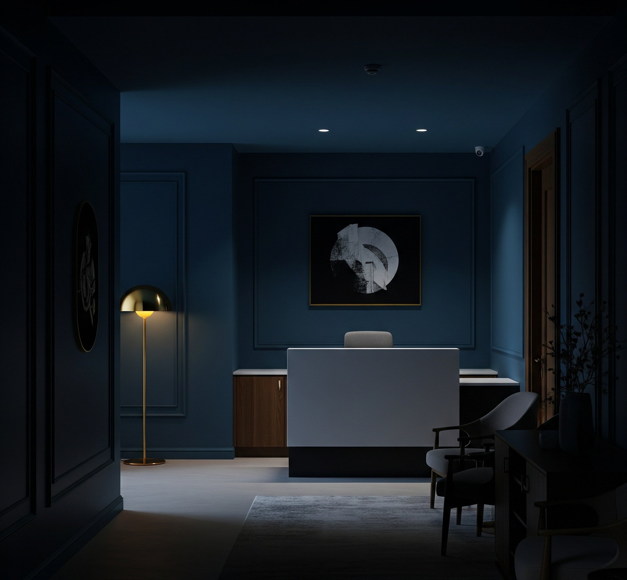
Now, stop and ask yourself: What just happened? You didn't get a message. You didn't hear a pitch. But color... color spoke to you before anything else did. And whether you're building a brand, running a business, or just trying to get a "yes" from someone, understanding how color works might just be the most powerful tool you're completely underusing.
Think about your last trip to the grocery store. You weren't just looking for an apple, were you? You were probably looking for that specific vibrant red that just screams "crisp and juicy!" Or those greens – not just any green, but that deep, healthy emerald that tells you it's super fresh. We make snap decisions, often without even realizing it, all based on these visual cues. Color isn't just about seeing; it's about knowing. It's an ancient language we've been speaking forever.


Okay, let's talk real business. If you're a marketing leader, staring at spreadsheets, planning your next big campaign, you have to get this. Because while everyone else is stressing over ad copy, the truly smart players are using the silent power of color.
Look at the biggest brands. Is it just luck that a huge tech company uses a calm, trustworthy blue? Or that fast-food places go for those bold reds and yellows that make you feel hungry and like you need it now? They're not just picking colors they like. They're carefully choosing colors to make you feel something specific. A small tweak in a logo's shade can completely change how you see a company – maybe it makes them seem more reliable, or faster, or more luxurious. It's the difference between something that's "okay" and something that's "I have to have that!"
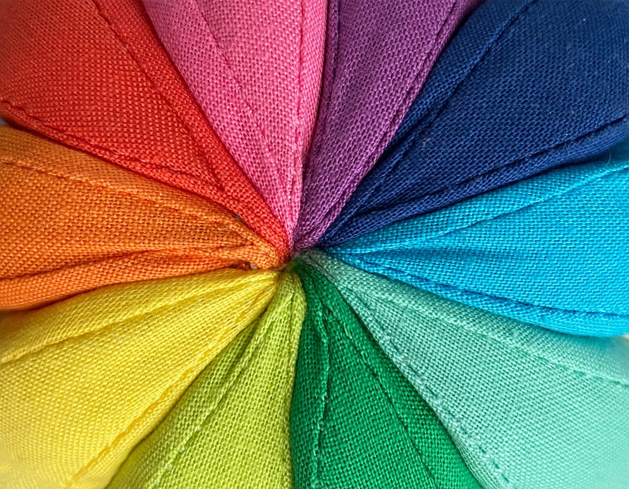
Remember learning about primary, secondary, and tertiary colors in school? Red, blue, yellow, and all their variations. It felt so... fixed. But here's the cool part: color is anything but static.
Think about fashion or even home decor. Every season, "new colors" pop up everywhere. Are these just random trends? Or are they carefully chosen to tap into how we're all feeling, what's going on in the world? Like that "dusty rose" that suddenly became huge, or a specific "forest green" that dominated for a year. These aren't accidents. They connect with our collective moods, our hopes, or even bigger shifts in society.
Color is energy. And emotion. And memory. Let me explain:
When you see red, your brain actually speeds up your heart rate. That's why it's used for stop signs. For danger. For urgency. But also – think passion, love, action. That's why fast-food chains use it: Urgency plus appetite equals a quick sale.
Now, look at blue. It's calm. Trustworthy. Clean. Banks love it. Tech brands are obsessed with it. It signals stability. Safety. You're not just seeing a color; you're being guided to feel something.
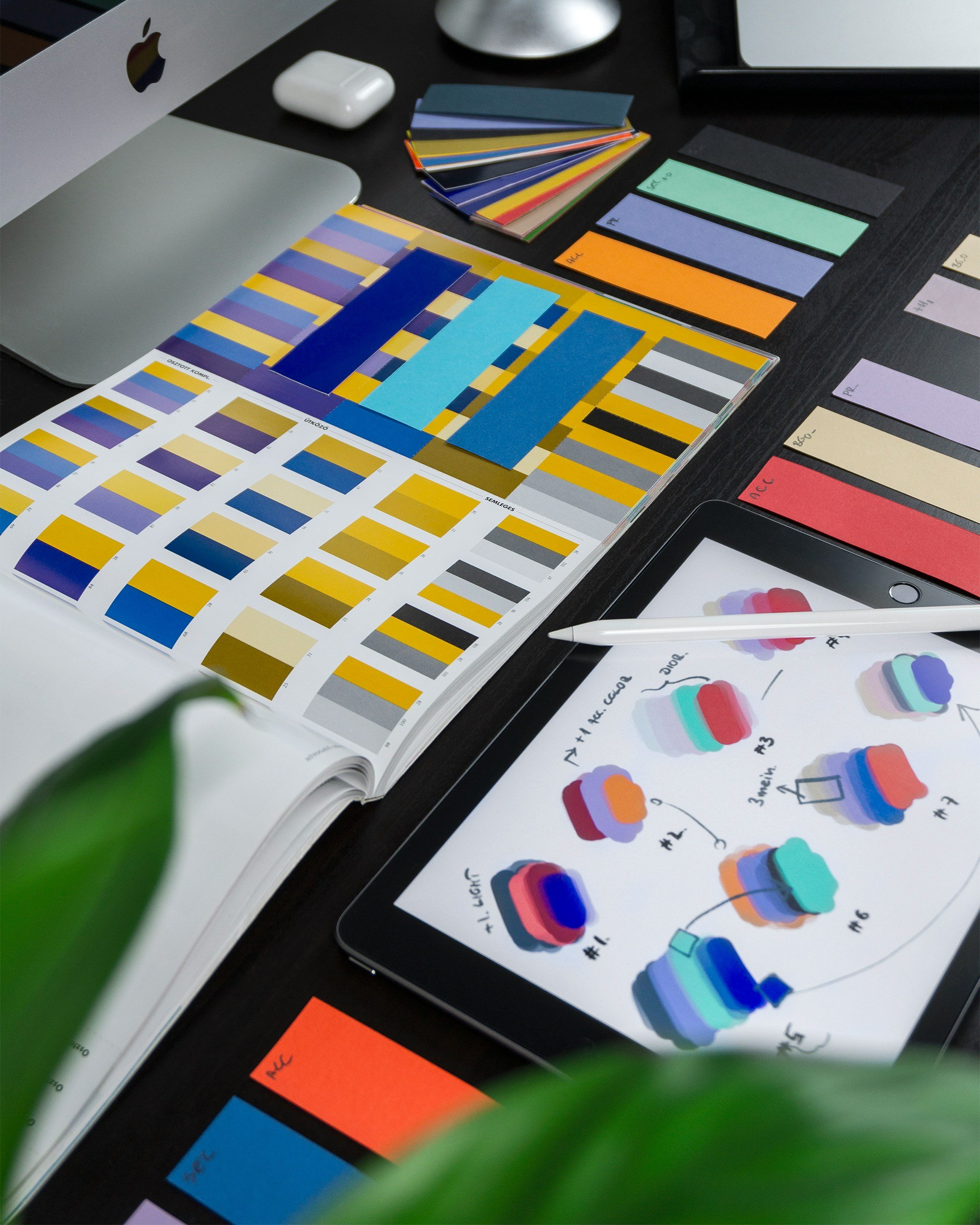
Modern branding rarely uses just basic colors. It's not "just red." It's coral, wine, brick, scarlet. Not "just blue"—it's slate, cobalt, powder, midnight. Brands aren't just choosing colors. They're choosing emotions. Temperatures. Memories.
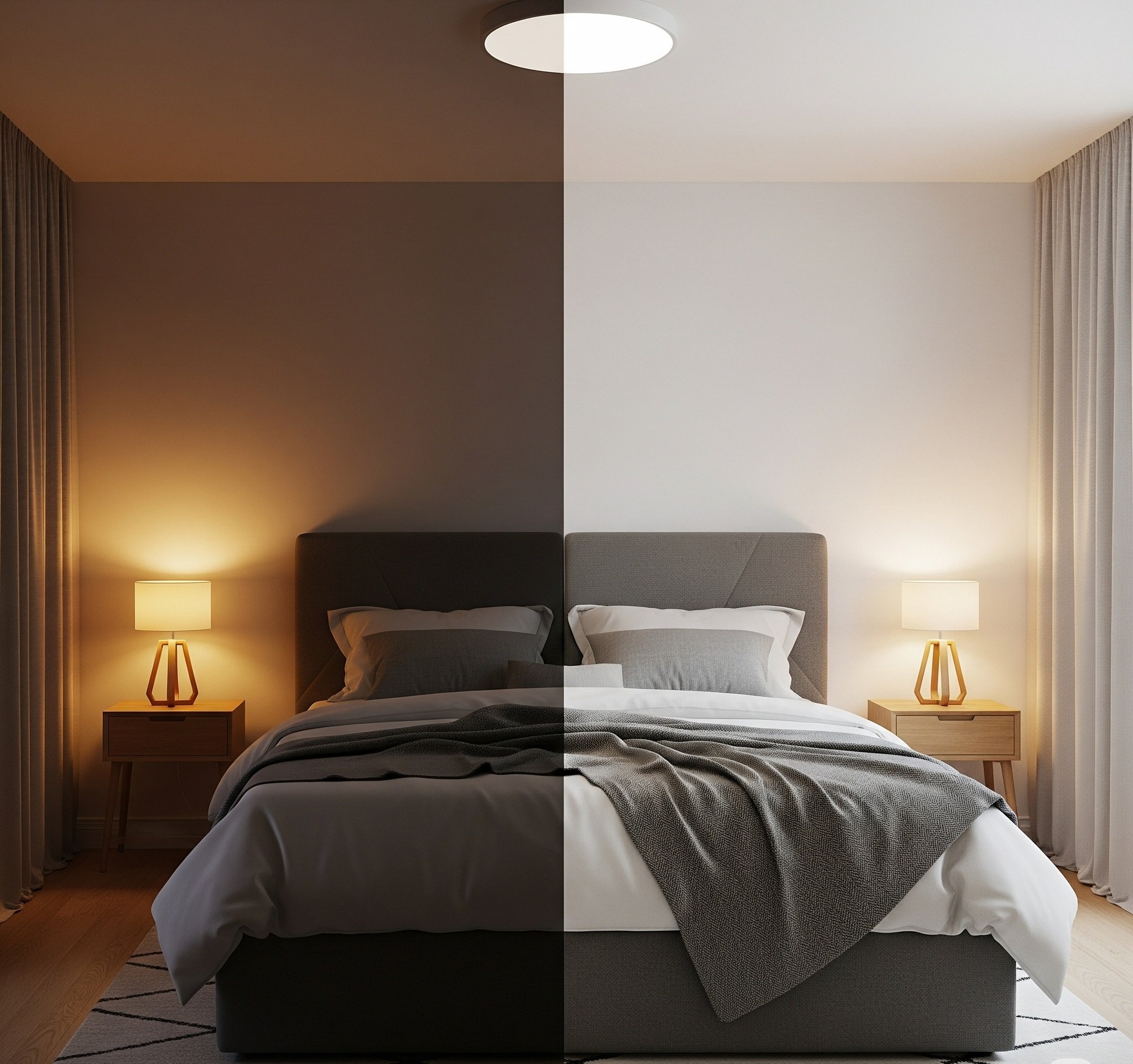
And color isn't static. It shifts. A pale pink under candlelight? Romantic. Under a hospital light? Drained. Clinical. This matters – especially in digital marketing. Colors shift across screens, different lighting, and devices. That soothing sage green on your designer's Mac? It might look like swamp water on an Android. That's not just an aesthetic issue—it's a conversion issue.

So, the big takeaway? Color isn't just a creative decision—it's a strategic one. It impacts emotion, memory, trust, and behavior in just a split second.
If you're launching a product... building a pitch deck... or designing a landing page... ask yourself not just what looks nice, but what feels right for your message? Because color isn't just what people see. It's the spark they feel... before they even know they're ready to say yes.
Thanks for listening to Spark Behind the Sale—your 5-minute shot of strategy that sells. If this episode got you thinking, follow the show and share it with someone who needs to see their brand in full color. I'm [Your Name]—and I'll catch you next time, with another spark that brings you closer to the sale.

You can dive deeper into this topic on our podcast, or explore a wide range of other strategies to help you sell smarter, not harder. Tune in to "Spark Behind the Sale" wherever you listen to your favorite shows!